Using White to Balance Prints

I love how white can tone down a print and still light the pattern shine through. It's also a great way to balance a design when using multiple prints:


The above earrings I snagged at a flea market this week for $3! I'm obsessed...

I also love how Bee from Atlantic-Pacific paired a white blazer over a fun printed dress:


This is the only way I could do a white room. If it was covered in prints, especially that David Hicks Fiorentina pillow:
Via CocoCozy

I used a white couch in my office to balance out the patterned wallpaper and pillows:


Have a lovely weekend!

Word of Warning

WARNING! This is for all fellow bloggers out there. I received a message when I was uploading some photos to post to my blog that my Picasa web albums were full and I needed to purchases more space. Me, being the cheap person that I am (yes that's right, the girl who owns a Celine bag) decided whatevs, I ain't payin $3 a month to post photos to my blog and deleted a bunch of photos I had in the picasa albums to make space. BIG MISTAKE! Little did I know, it's connected to my blog and it deleted all the photos off my blog that I deleted from the Picasa web album. So if you see a hideous circle with a dash through it, that's my cheapskate actions in all its glory. And there's no way of getting them back unless I go through my whole blog of 3 years, find the ones I deleted, and reupload them to each individual post.

I am as angry as this turtle right now:

and this baby:


and this cat:


That's a whole lotta anger my friends...a whole lot...

Zebras Dancing Through My Head

Alright, I cannot get this Scalamandre zebra print wallpaper out of my head. Last night, I was going back and forth about ordering it for my little home. Here it is currently:


Yes, the green leather couches are my worst nightmare, but they were there when I moved in and will not be accompanying us to our next home, that is for damn sure. However, the red dining room was really pretty and I didn't want to change the color. I made it work and decided to embrace the color scheme and actually ended up liking it. (No couches, you are still hideous.) Wouldn't the green look amazing somewhere on my first floor??


And my lovely scarf from Spotted Moth arrived yesterday, so I couldn't help but dress inspired by my home: (p.s. dont' mind my dog Luigi trying to make out with me the whole time...)


Trend Alert: Zebra Prints

I know what you're thinking. By the title of this post, you're thinking the traditional zebra stripes, but oh no my friends, we're talking the actual zebra animal in all its glory.

I just ordered this super duper cute scarf from Spotted Moth (in kelly green):


Via theproperstranger.tumblr.com

Via Kelly Wearstler
The above umbrella, which is the mac daddy of all umbrellas, is ScalamandrĂ©’s Zebra Print. I completely fell in love when I saw it installed at this year's Kip's Bay Decorator Show House. These little guys will be prancing through my home someday...

Here'e the foyer design from the show house, done by Bryant Keller whom I met in person there. Nicest guy by the way:

Image via NY Times
The ScalamandrĂ© Zebra Print was first designed for Gino's Restaurant in NYC in the 1940s. According to my research, that's the only place it was used it until relatively recently when they reintroduced it and came out with more colors. The owner of Gino's had always wanted to go on an African safari, but couldn't afford it. He said he thought he could at least afford to have zebras on his wallpaper. He commissioned his friend, Franco Scalamandre, to design it.

Image via La Dolce Vita
Image via Habitually Chic

Image via odietamoblog.blogspot.com
So fun, right? Obviously, it's quite expensive since it's become so popular in the design world, but it's perfect for a small space or accent wall, meaning hopefully I'll only need to order one roll. Hopefully...

Combining Prints of the Same Hue

I love combining prints and pattern, whether it's in an outfit or in a room. It's still pleasing to the eye, but creates tons of visual interest. It's especially done well when you keep it within the same color family and don't use all the same scale prints:

Via Kelly Wearstler
P.S. I got to see some of Kelly Wearstler's fabric in person at the Kravet's home office at Blogfest, which the recap is still being worked on and I promise to share soon! Anyway, I'm sure some of my drool is still on their table after seeing her newest collection...

Via bhg.com
Via southernpiphi.tumblr.com

Here's how I combined prints this past week:


And this girl just looks amazing all around, from her outfit to her living space:

Via lolalina.com
Via http://domestikatedlife.com/
Happy weekend everyone!

Lime Green + Navy

I work in an office that is casual, but I could need to be dressed up at any moment should I need to go out for a showing on one of my properties I have listed. I didn't have any meetings set up for today, finally, so I really wanted to wear flats vs the heels I've been tortured with all week and my fun bright lime green jeans to work. I also got this super cute eyelet blouse over the weekend at the amazing Loft sale I couldn't resist hitting up (50% off clearance?? I was born for this stuff...). However, I could have to run out to a showing, so the obvious answer was a blazer. I grabbed my navy one and realized lime and navy are quite the compatible pair:


P.S. It's not super noticeable in the pics, but I just had highlights done with the balayage technique. I highly recommend it if you want a more natural, sun-kissed look...

Of course the color combo got me thinking about how it would look in a room design, and I have to say it's just as successful:
Via Pinterest

Via Champagne Lifestyles

Via Camille Styles

Btw, I also scored these adorbs spotted jeans at the Loft sale over the weekend. In my defense, it had been awhile since I'd been in there, so I feel a tad better about that fact. Just a tad... 


Gold Studs

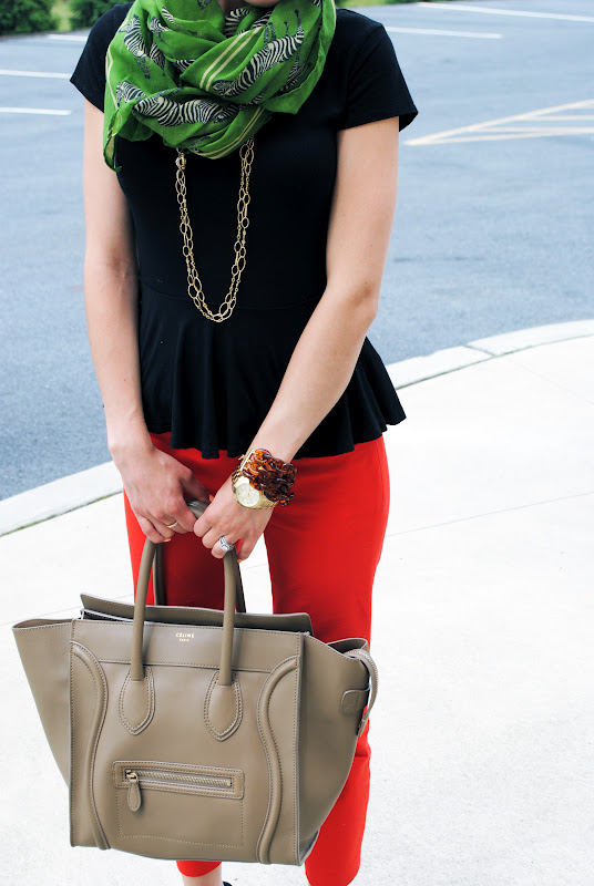
Happy Friday! I always love when a holiday falls on a Monday. The work week zooms right by and it's the weekend again before you know it. Today, I'm wearing a blouse I've grown to have a mild obsession with. I bought it in New York when I was at Blogfest from Zara. I wore it twice already and if you know me personally, you know that rarely happens in the same year.


Btw, it took me like 15 minutes if that to curl my hair this morning with my new best friend:


I was slightly skeptical when I bought it because I literally cannot do my own hair. I don't know what it is, but a 4 year old could probably style their hair better than I can. I had a few burns in the beginning, but now I've got the hang of it and only have about 1 burn every so often, a serious record for me.

Anywho, my blouse reminds me of Phillip Jeffries' rivets wallpaper line. I'm anxiously waiting to use this sometime in my career, even if it ends up being in my own house:


Here it is in gray:


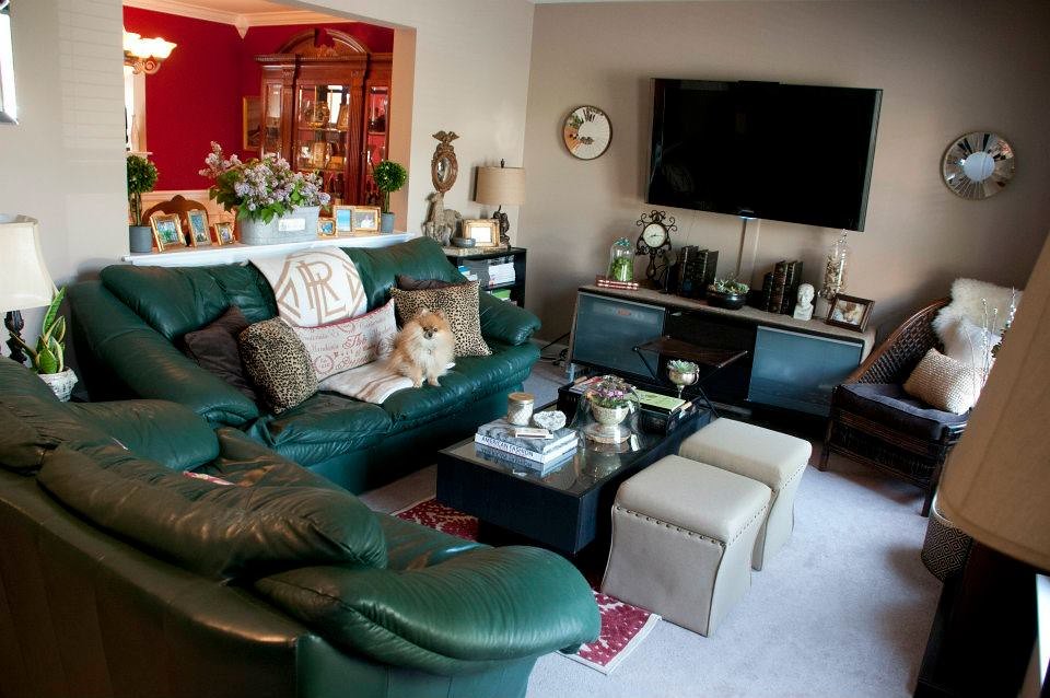
The above design is by Tilton Fenwick, a fantastic design team based out of New York. They're the designers behind this whole room, which I featured for the National Geographics shot before. I just realized this was all one insanely good room:


They're also the designers behind this perfectly wallpapered bedroom featured in Lonny:


I digress, here is the wallpaper in tan as well:

Image via Decorpad

Yep, going right in the inspiration folder for the ol' casa. Have a great weekend!

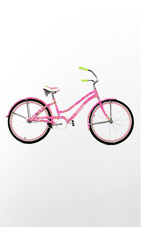
P.S. I FRIGGIN WON THIS LILLY PULITZER BIKE!!! I just heard from the amazing people at Kravet from Blogfest!! Me and Luigi (my mini pomeranian) are going to be seriously styling this summer. I feel as excited as a kid on Christmas right now...